
SUNDOG BRIEF
Getting to work with clients in a variety of industries never gets old. So when Gordon Goodwin approached me about designing a logo for his business, Sundog, it was an eye-opener. Gordon is a Gaffer working in the TV and Film industry in London.
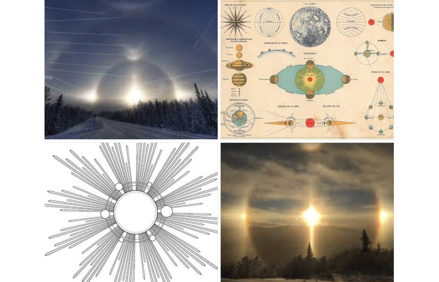
A gaffer works with the director of photography to create the lighting effects in a film. I felt the identity had to reflect the three key areas of the role, creative vision, technical expertise and a priority understanding of safety on set. So inspired by the importance of light, Gordon named his business Sundog after an atmospheric optical phenomenon. Its caused by the refraction of sunlight by ice crystals in the atmosphere.
INSPIRATION
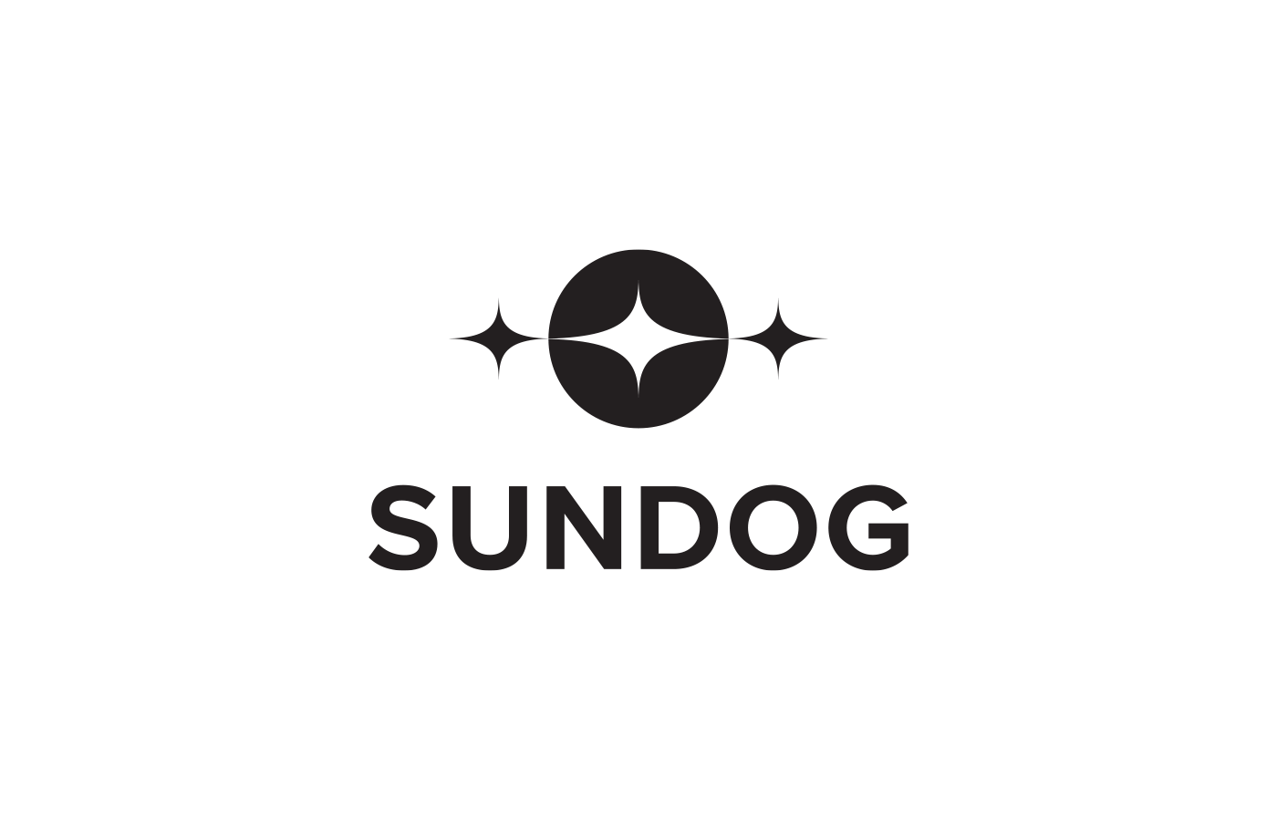
But how to represent this ethereal lighting effect in a robust graphic format? I found inspiration in the illustrations on vintage maps of early navigators. They also were challenged with representing the heavens in simple graphic forms. I was keen to use the same language of the geometry of shapes and lines to illustrate the Sundog.
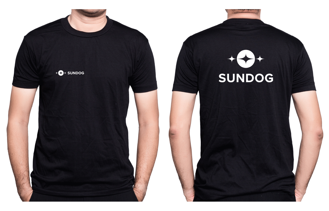
Once the logo mark was finalised I searched for a font to complement the pure geometric shapes. The font Proxima Nova Bold with its clean modern lines and circular shapes felt like a perfect match.

CLIENT // Sundog Gordon Goodwin
SERVICES // Brand Development, Visual Identity
CONTACT // Lana O’Flynn
THANK YOU FOR YOUR TIME