
INFLIGHT DUBLIN BRAND REDESIGN AND DEVELOPMENT
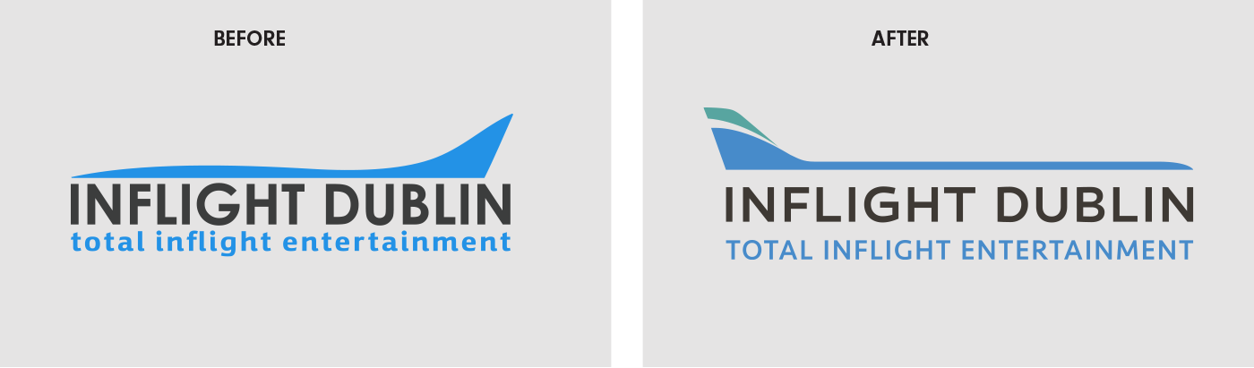
In the last 4 years I have led a team of designers to redesign and redevelop the Inflight Dublin Company branding to ensure that all marketing material is consistent, and presented in a professional and engaging manner. Ensuring the branding worked on various platforms including stand design for industry events, brochures, the company website, motion graphics and social media communications. The first step in a 2 stage process was a redesign of the Inflight Dublin identity and refresh of the existing marketing material.
BUILDING A BRAND LANGUAGE
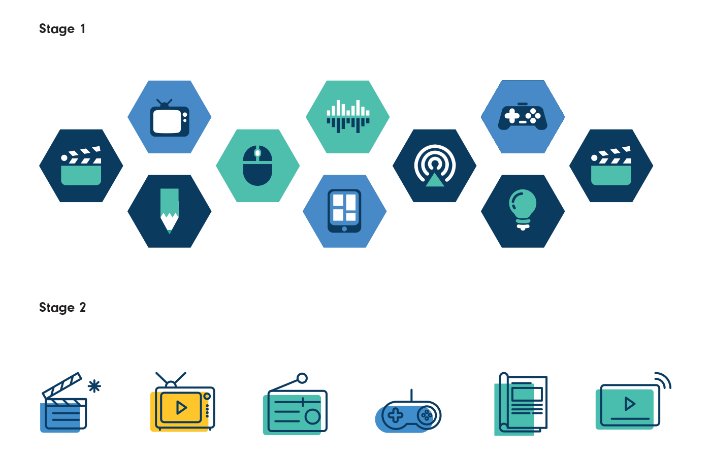
Hand in hand with the logo redesign I started to build the brand language. To explain Inflight Dublin's diverse range of services to an audience who is time poor and where English is not the first language the design team had utilised a suite of icons as a key part of its brand language. As part of an ongoing brand development these icons were developed and refined over the 4 years. Once the core and ancillary services were agreed I refined the icons in stage 2.
THE COLOUR PALETTE
I extended the original colour palette of blue and black to include a secondary palette. This seemingly small change immediately improved the flexibility and impact of the brand language.

BRAND PATTERN
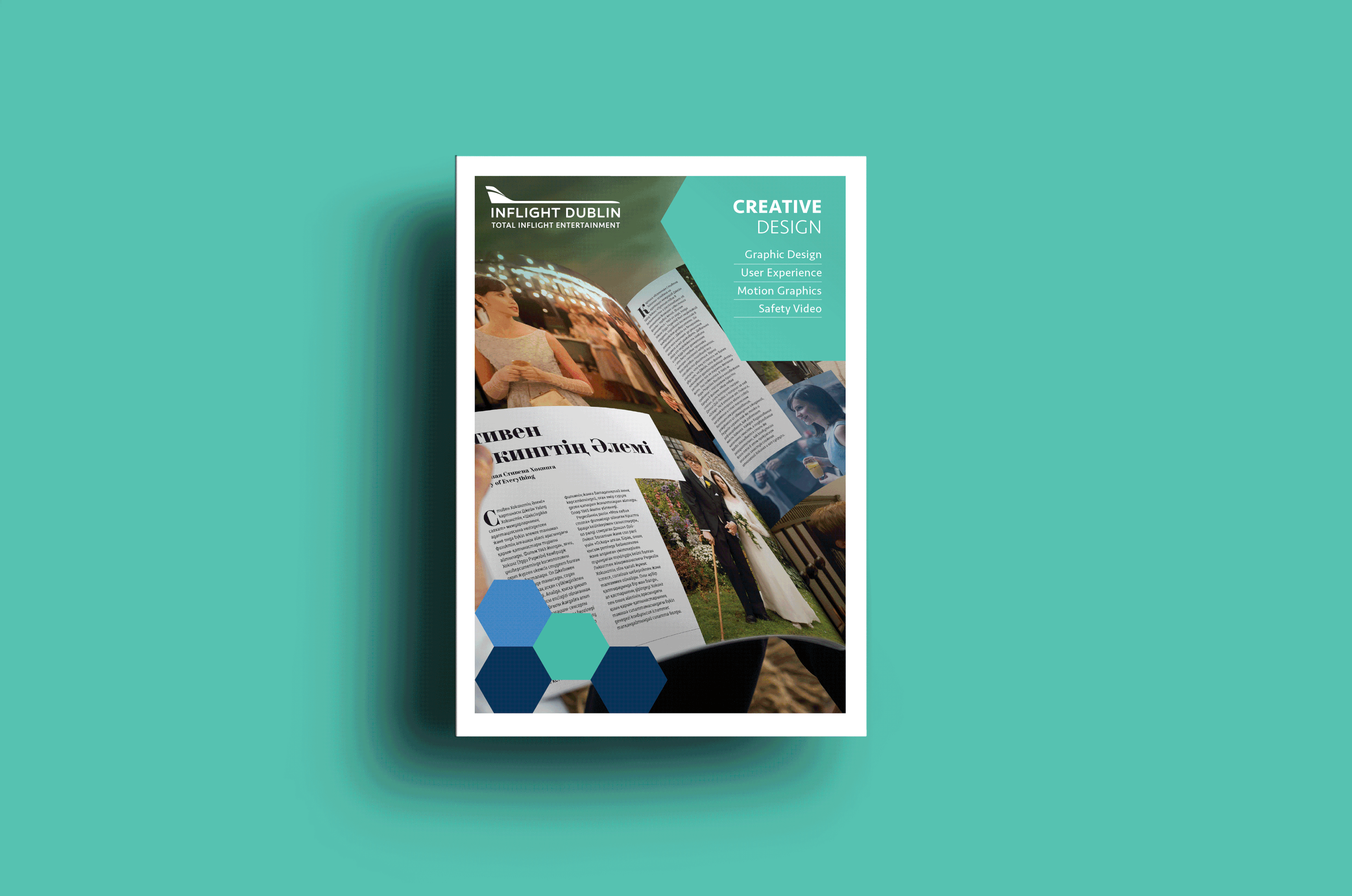
With most of the company services offered on an aircraft (inflight) our access to good in cabin photography is challenging. So it was a natural progression to look to illustration and pattern to fill this gap in the brand toolkit. Whilst working with patterns we transitioned from hexes to triangles to provide more flexibility of use.

MARKETING MATERIAL
I was fortunate to be able to work with the design team and refine the brand language while working on the marketing material. We were able to test the brand toolkit while working on daily communication materials. I could see what was working and what wasn’t and take action. I was also able to see how the design team was interpreting the brand guidelines. In the press ads below you can see how expanding the colour palette increases the brands impact.
EVENT DESIGN
For Inflight Dublin one of the key marketing and sales opportunities during the year are aviation expositions. These expos offered the opportunity to have face to face time with potential and existing clients. Therefore it was essential that the stand design not only attract attention but also present the company as innovative and professional. Working with on-site stand suppliers in the US and Europe had its challenges but I always ensured through daily communication that the stands were supplied on schedule and correct as per specifications.

INFO-GRAPHICS AND ANIMATION
One of the continuing challenges for the design department is to visually communicate complex services in a clear and simple way. Info-graphics and explainer videos were a go to format to help with this process. I found a paired back, flat, linear illustration style helped to emphasis the message. The journey path infographic below took several iterations over the years to get to this version. Having designed the infographic I was excited to collaborate the with motion graphic team who developed the animated version.

DIGITAL COMMUNICATIONS AND WEB
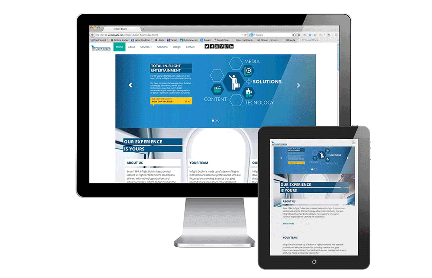
Another key communication platform is the company website. I oversaw 2 completed iterations of the Inflight Dublin Website. The 1st stage was to create a clear responsive website to replace an existing outdate website. I worked with the management team to distil the company message and services to create clear bite size elements of content. 2 years later I oversaw the design team as they created the latest version of the website.
CLIENT // Inflight Dublin
SERVICES // Brand Development, Visual Identity, Illustration, Typography, Art Direction
CONTACT // Lana O’Flynn
THANK YOU FOR YOUR TIME